Color Symbolism Theories
Colors are more than just visual stimuli—they evoke emotions, memories, and meanings in two primary ways: through natural associations and psychological symbolism. No, it’s not mind control! But people do feel a certain comfort when colors remind them of familiar experiences. For instance, a calming shade of blue instantly brings to mind clear skies and peaceful waters.
How Colors Communicate Meaning
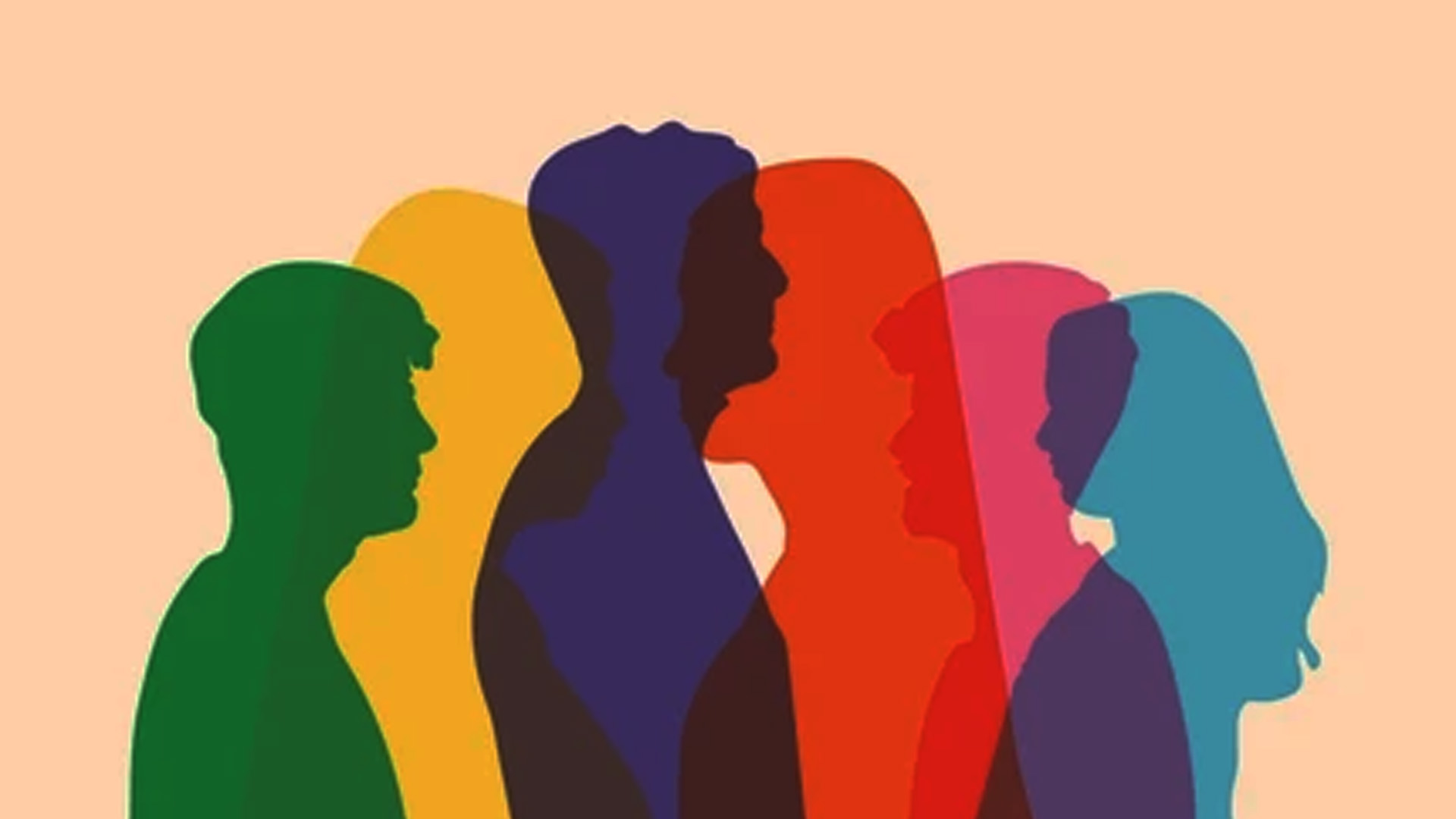
Effective design hinges on understanding the ways colors influence perception. Some meanings are straightforward—red reflects fire and passion, blue symbolizes the serenity of water and the sky. Others are layered with cultural significance, shaping our emotions and reactions in ways we may not even realize.
Natural Associations: Colors in Nature
Colors found in nature have universal symbolism. For instance, green has always represented vegetation and renewal, while blue symbolizes vast skies and oceans. These associations have remained unchanged throughout human history, making them a natural foundation for color psychology.

Cultural & Psychological Associations
Colors take on additional layers of meaning through cultural influences. Unlike natural associations, these meanings vary across regions and traditions. Green, for example, is widely connected to nature and growth, but in different cultures, it can symbolize luck, wealth, or even jealousy.
How Colors Gain Their Symbolism
The meaning behind colors stems from several sources:
- Cultural associations: Colors are tied to traditions, celebrations, and even geography. For example, green symbolizes luck in Ireland and heaven in Islam.
- Political & historical significance: Flags, political movements, and royal traditions influence perceptions of color. Libya’s flag is entirely green, while Japan’s Emperor Hirohito loved green so much that "Green Day" was celebrated in his honor.
- Religious & mythical connections: Spiritual beliefs often assign unique meanings to colors. In Celtic mythology, the Green Man symbolizes fertility, while in modern pop culture, green is associated with extraterrestrials.
- Linguistic interpretations: Languages influence how colors are categorized. For example, South Pacific languages describe greens based on plant growth stages, while in Scottish Gaelic, "gorm" refers to both blue and the color of grass.
- Modern trends & fads: Contemporary usage also shapes how colors are perceived. Green represents "go" on traffic lights worldwide, while "lime green" became a stylish trend in fashion and advertising in the late 1990s.
Dual Symbolism in Colors
Interestingly, some colors carry opposite meanings. Take blue—it reflects serenity and stability, yet it’s also linked to sadness in phrases like “feeling blue” or “singing the blues.” Red is another example—it’s the color of passion and energy, but also represents warnings, as seen in stop signs worldwide.
While no color has an absolute meaning, understanding their origins and effects allows designers and brands to create more powerful visual experiences. Whether you’re choosing colors for branding, interior design, or fashion, knowing their underlying symbolism can make all the difference!
⬇️ Latest Blog - click to view ⬇️