Color Theory
Stay updated with the latest insights on Color Theory, along with a curated selection of videos and articles. Spark discussions and creativity by sharing this page with others!
What is Color Theory?
Color theory is the study of how Color s interact and influence human emotions and perceptions. It serves as a fundamental tool for artists, designers, and creators, helping them make informed decisions about Color combinations that enhance visual appeal and convey specific moods or messages. By mastering Color theory, you can create striking designs that resonate with your audience.
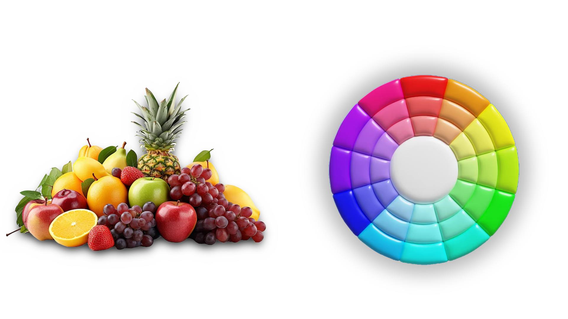
The Three Key Elements of Color : Hue, Value, and Saturation
Every Color consists of three essential components:
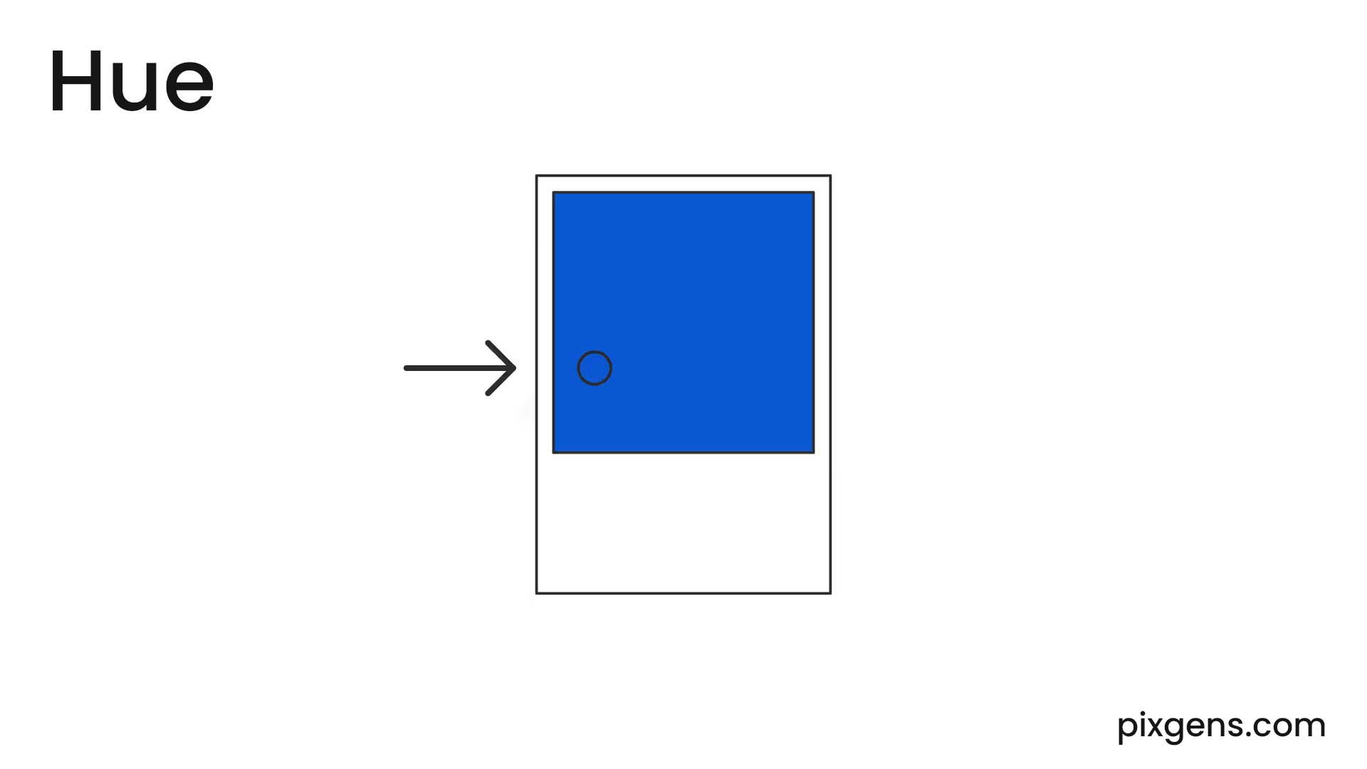
- Hue: The pure Color itself, such as red, blue, or yellow. It is the attribute that differentiates one Color from another.
- Value: The measure of lightness or darkness in a Color . Adding white creates a tint, while adding black produces a shade.
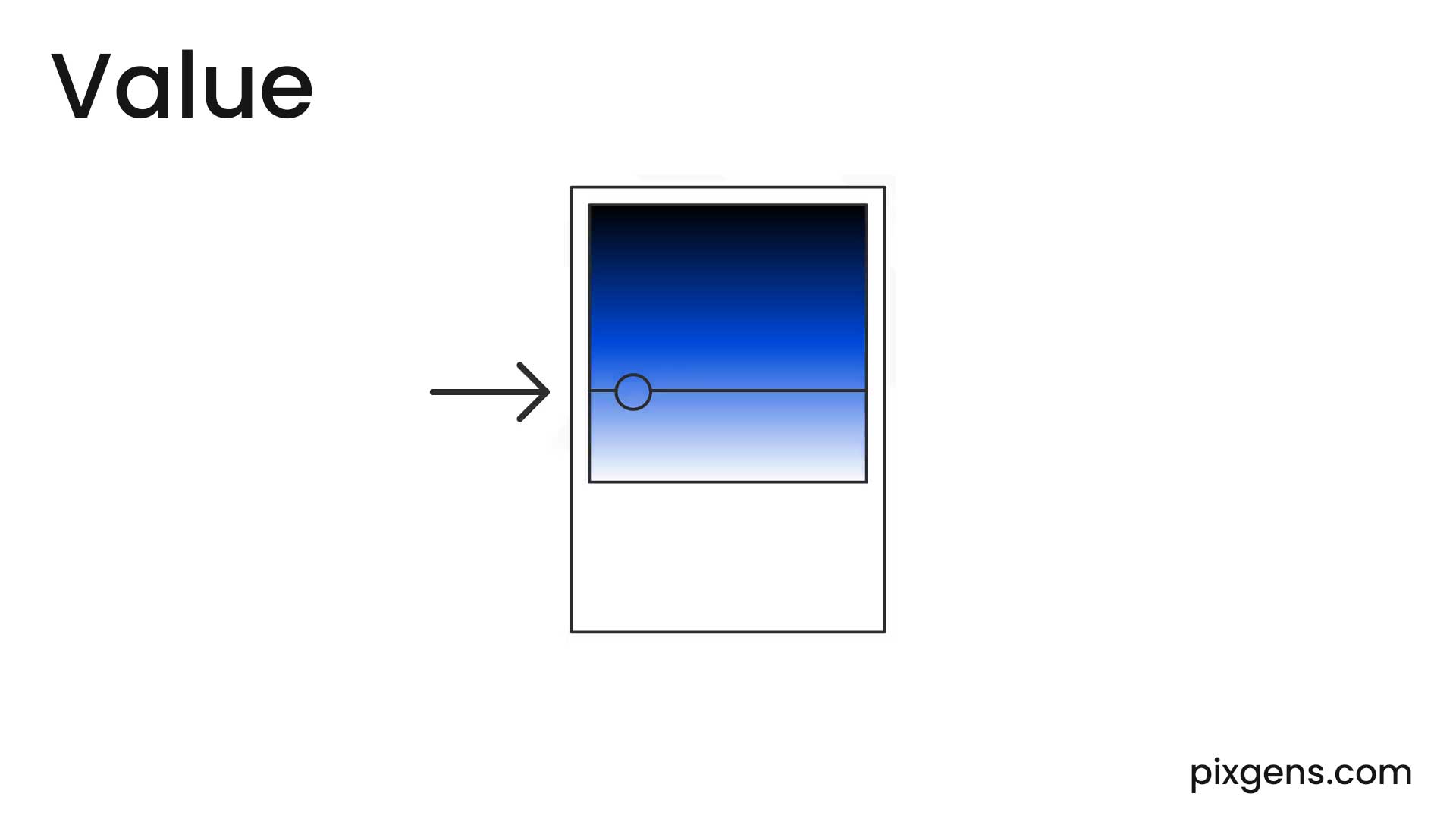
- Saturation (also known as chroma): The intensity or purity of a Color . Highly saturated Color s appear vivid, whereas desaturated Color s look muted or grayish.
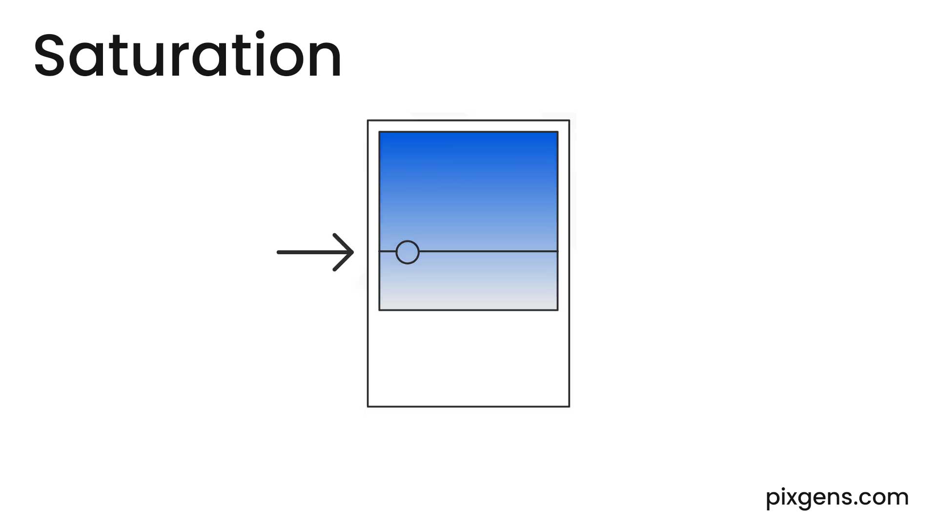
Understanding these elements helps in creating dynamic and engaging Color compositions.
The Color Wheel
In screen design, the additive The Color wheel is a visual representation of Colors arranged in a circular format, traditionally based on red, green and blue as primary Colors. It serves as a foundational tool for artists, designers, and creatives to understand Color relationships and harmonies.
The concept of the Color wheel dates back to 1666, when Sir Isaac Newton developed the first circular diagram of Color s. Since then, numerous variations have been studied and refined by both scientists and artists, each contributing unique perspectives on how Color s interact.
There are also definitions (or categories) of Color s based on the Color wheel. We begin with a 3-part Color wheel.
- Primary Colors: Red, yellow and blue
In traditional Color theory (used in paint and pigments), primary Color s are the 3 pigment Color s that cannot be mixed or formed by any combination of other Color s. All other Colors are derived from these 3 hues.
- Secondary Colors: Green, orange and purple
These are the Color s formed by mixing the primary Color s.
- Tertiary Colors: Yellow-orange, red-orange, red-purple, blue-purple, blue-green & yellow-green
These are the Color s formed by mixing a primary and a secondary Color . That's why the hue is a two word name, such as blue-green, red-violet, and yellow-orange.
Use a Color Scheme and Color Temperature for Design Harmony
In screen design, the additive Color model is used, where red, green and blue (RGB) serve as the primary Color s. Just as careful placement of images and design elements enhances visual composition, selecting the right Color s is crucial for creating appealing and user-friendly interfaces. To ensure an engaging and high-usability design, consider incorporating one of these fundamental Color schemes when beginning your design process.
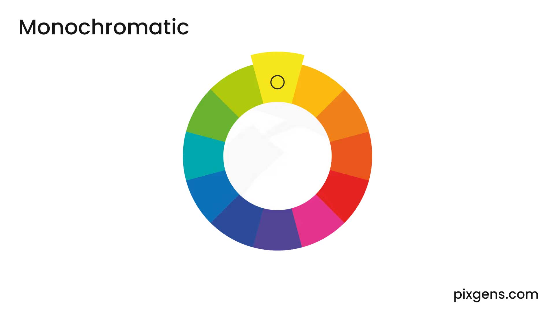
- Monochromatic: Variations of a single hue.
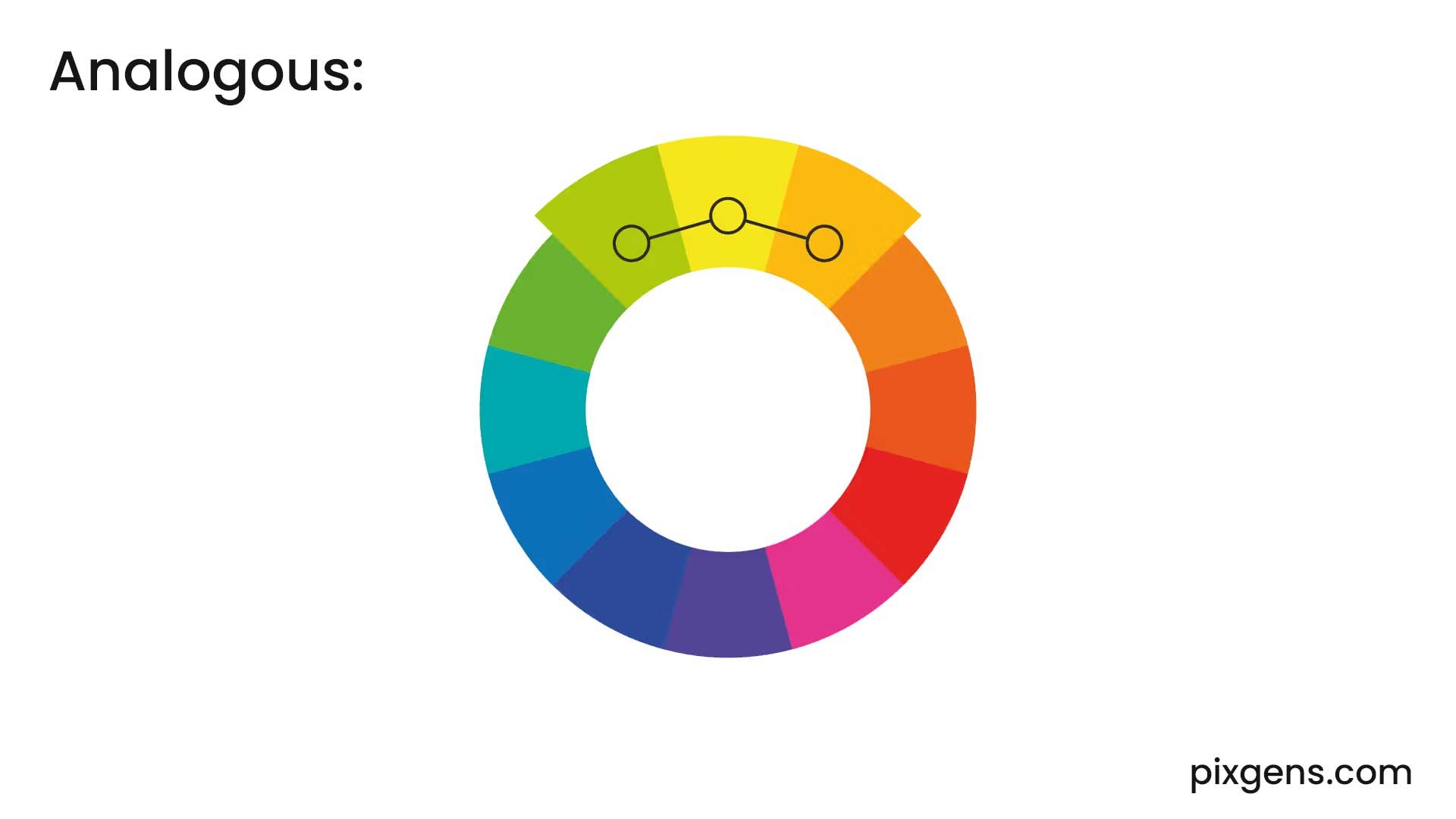
- Analogous: Colors next to each other on the color wheel.
- Complementary: Opposite colors that create contrast.
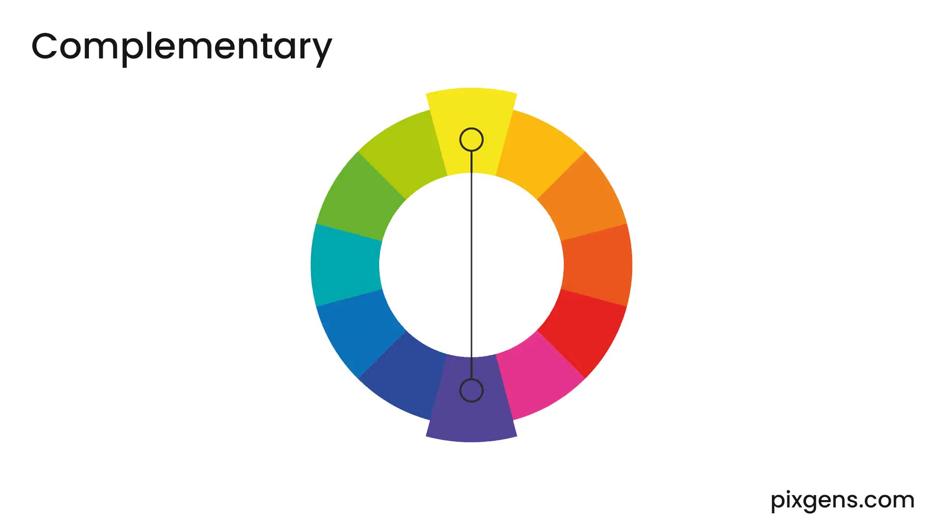
- Triadic: Three evenly spaced colors for balance.
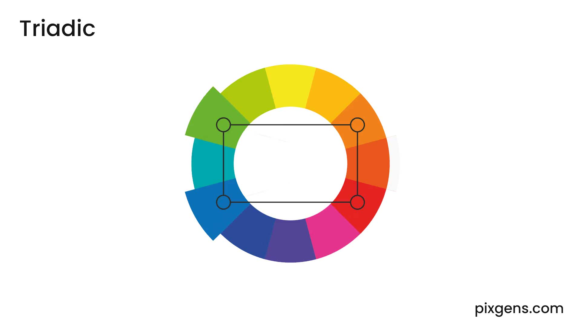
- Split-Complementary: A variation of complementary colors with added complexity and softened contrast.
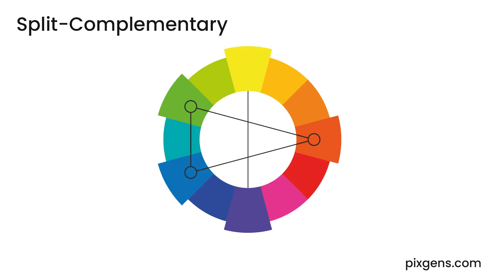
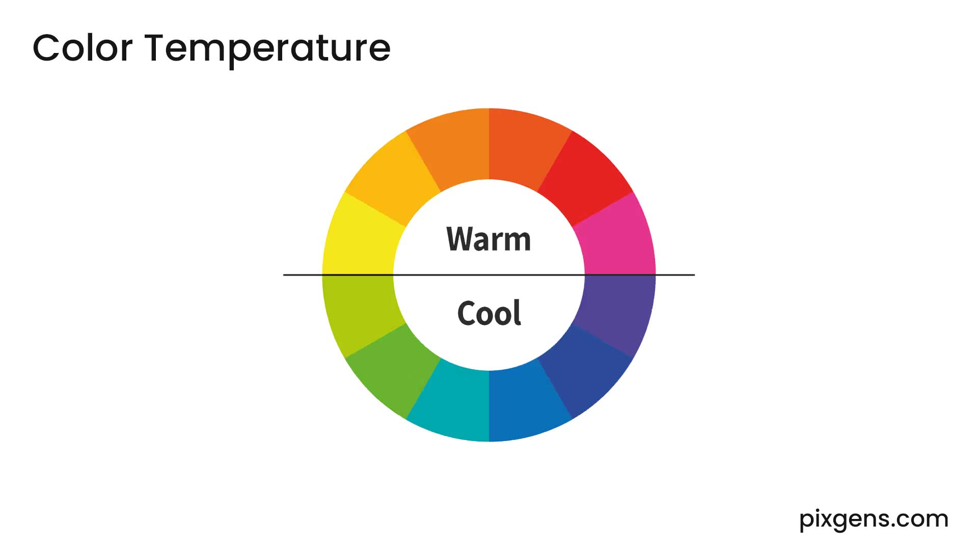
- Color Temperature: Colors are categorized as warm (reds, oranges, yellows) or cool (blues, greens, purples).
Color context
Color context refers to how colors interact with each other and how their perception changes based on surrounding colors. The same color can appear different depending on its background or adjacent hues.
For example :- A gray square may seem lighter or darker depending on the background color.
- A red hue might appear more vibrant when placed next to green due to contrast.
- Colors can evoke different emotions depending on their context—blue in a corporate logo may feel professional, while blue in a sunset painting may feel calming.

