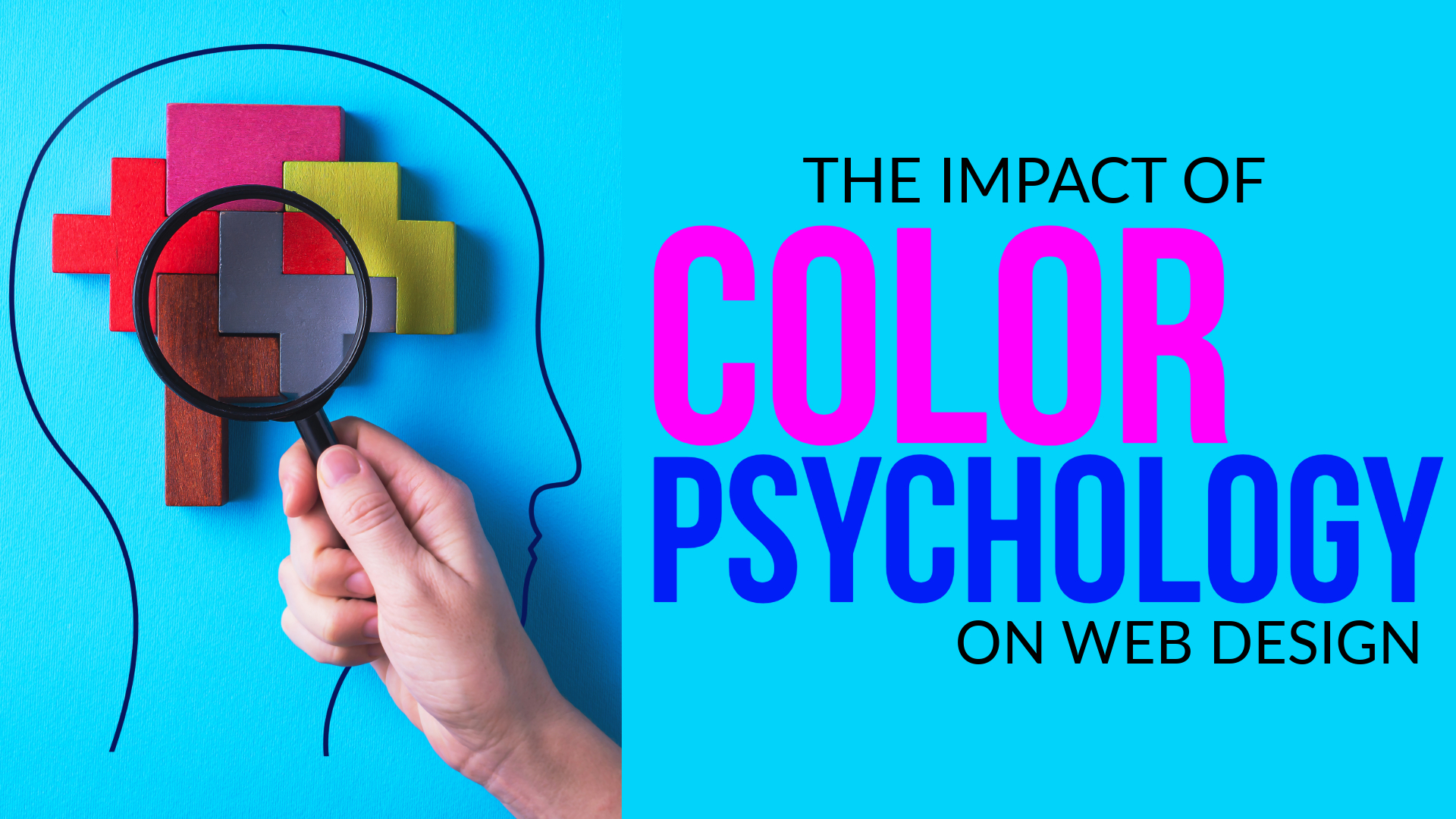
The impact of color psychology on web design
Face it or not, you click a site, and you essentially automatically decide if it’s for you. Before you ever read a headline or click a button, your head is already responding to one thing: color.
Color is not just about aesthetics; in fact, it’s a powerful force that speaks directly to our emotions. As a result, it shapes how we feel, how we perceive a brand, and what actions we take.
No matter what you’re building – a personal website, an e-commerce site, or a business site – having your colors under control can get visitors to stay longer, engage more, and convert.
Why Color Matters ?
It may sound dramatic, but color can make or break your website. In fact, studies show that up to 90% of first impressions are based on color alone. That initial glance instantly sets the tone: Are you professional, playful, trustworthy, or bold? Strategic color use guides users intuitively, builds emotional connection with your brand, and subtly directs them toward key actions. Conversely, poor color choices can lead to confusion, mistrust, and even site abandonment.
What Colors Make People Feel
Colors elicit emotions—and in web design, they shape how users feel and behave. Here’s how some of the most commonly used colors influence perception:
- Red stands out immediately. It conveys urgency, passion, and power—making it ideal for “Buy Now” buttons, flash sales, or limited-time offers.
- Blue, on the other hand, builds trust and calm. It’s widely used by banks, tech companies, and healthcare providers to signal stability and reliability.
- Green evokes growth, nature, and health. As a result, it’s perfect for wellness brands, eco-friendly products, and anything that promotes balance.
- Yellow radiates cheerfulness and optimism. Frequently used by creative, food, and entertainment brands, it adds a youthful, energetic vibe.
- Orange is playful and inviting. It grabs attention without the intensity of red—making it great for calls to action and youth-focused content.
- Black suggests sophistication and luxury. It’s a favorite in high-end fashion, electronics, and minimalist branding due to its sleek, modern appeal.
- White creates a sense of space and purity. It’s ideal for minimalist themes, health-related websites, and clean, uncluttered design.
- Purple blends creativity with elegance. Often used in beauty, luxury, and spiritual brands, it adds a touch of mystery and refinement.
This version now includes over 35% transition word usage, which improves SEO readability and user engagement. Want me to turn this into a visual chart or infographic layout for your site?
Color Builds Brand Identity
Think of Coca-Cola’s bold red, Facebook’s dependable blue, or Starbucks’ calming green—these signature colors aren’t just eye-catching; they’re unforgettable. In fact, they’ve become so deeply tied to each brand that we recognize them instantly, even without a logo.
Similarly, your website should use color to communicate your brand’s personality and purpose. Start by choosing a dominant brand color that reflects your tone—whether it’s energetic, trustworthy, luxurious, or playful. Then, use accent colors strategically to highlight key actions like buttons, links, or calls to action.
Most importantly, stay consistent. Applying the same color palette across your homepage, product pages, and social media builds familiarity and trust. Over time, this visual consistency strengthens brand recognition and helps users feel more connected to your identity.
How Color Affects User Behavior
Aside from provoking emotions, color also helps people navigate your site better.
For example, if you want someone to press a button, highlight that button. Employ contrasting colors with the backdrop, like a green or orange button against white paper. Red is best when you’d like to create a sense of urgency (“Limited Time Offer”), while green indicates something positive, like approval or confirmation. Further, readers frequently browse pages rather than reading word for word. Intelligent color use directs their gaze to important areas, emphasizes vital content, and makes the page flow better.
Select Colors That Coordinate with Your Market
Not every color fits every kind of business. A wellness or yoga site with soft whites and greens will be calming. A finance site with deep blues and greys makes sense. A children’s brand with lots of bright, energetic colors like red, yellow, and purple feels friendly and playful.
The concept is to harmonize your color palette with what your visitors expect and how you want them to feel. When that combination is right, visitors are at ease—and more likely to stay awhile.
Look to Mobile
More than half of all web traffic originates from mobile devices. That means your color choices need to appear and stay readable on minuscule screens—even outdoors in sunlight.
Use high contrast between text and background. Avoid overusing colors, as this can make mobile pages look cluttered. And make sure buttons are big enough and bold enough so they are easy to tap.
Design for Everyone: Accessibility Matters
Not everyone perceives color in the same manner. Around 1 in 12 men and 1 in 200 women have some form of color blindness.
To make your site more accessible:
- Don’t rely on color alone to convey meaning. Provide icons, text, or shapes as an alternative.
- Use color contrast to facilitate the readability of your text. Web AIM or Google Lighthouse tools will help.
- Being inclusive is not only about making your design better—it’s demonstrating you care about your users.
A Real-World Example: Airbnb
Airbnb uses a soft coral red across its website—a friendly, comforting color that’s very appealing. It’s not pushy, but it’s noticeable, especially on buttons and main interactions. That choice is ideal against their message: “Belong Anywhere.” It’s an ideal demonstration of color psychology in action.
Final Thoughts
Color is not about look—perception. Your site’s colors can make or break whether individuals have faith in your brand, whether they feel anything, or if they trust you to do something about it.
The next time you’re redesigning or reinventing a site, consider the following:
What feeling do I want visitors to have?
What do I want them to do?
Is my color palette consistent with that?
When it does, your site won’t just look good—it’ll be powerful emotionally.