Basic Color Theory
Color theory includes a wide range of definitions, concepts, and design applications—sufficient to occupy several encyclopedias. Nevertheless, there are three fundamental categories of color theory that are both logical and practical: the color wheel, color harmony, and the context in which colors are utilized.
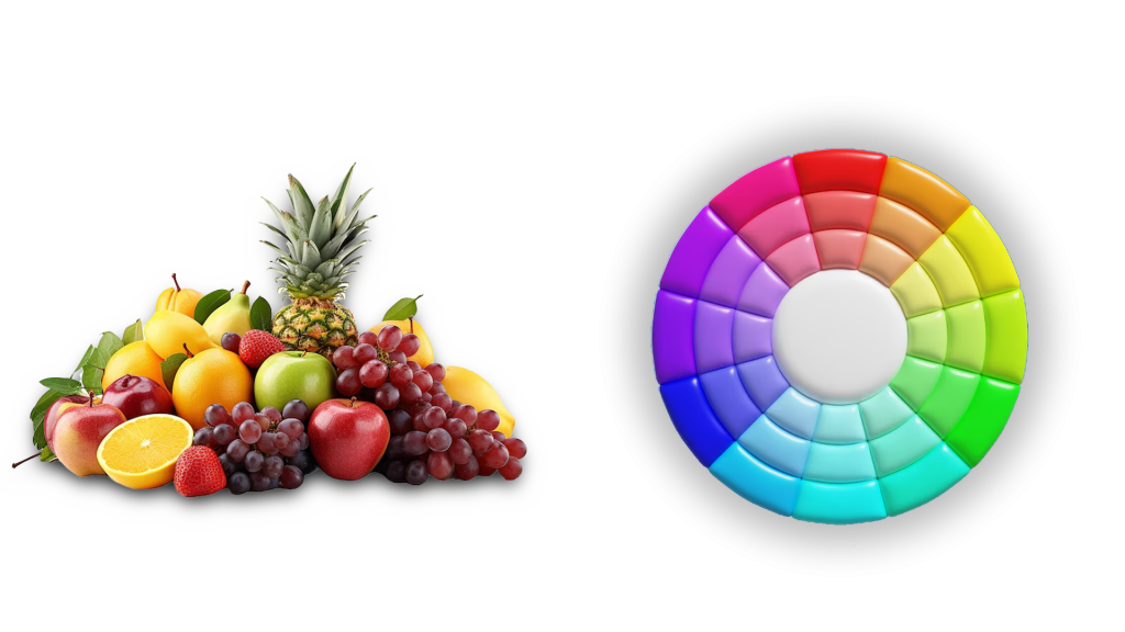
Color theories establish a coherent framework for color. For instance, if we possess a variety of fruits and vegetables, we can categorize them by color and arrange them on a circle that illustrates the relationships between the colors.

The Color Wheel
A color wheel, which is based on red, yellow, and blue, is a classic concept in the art world. Sir Isaac Newton created the first circular color diagram in 1666. Since that time, both scientists and artists have explored and crafted various interpretations of this idea. Ongoing disagreements about the superiority of one version over another continue to spark discussions. Ultimately, any color circle or wheel that displays a logically organized sequence of pure colors holds value.
Primary Colors: Red, yellow, and blue In traditional color theory (applied in paints and pigments), primary colors are the three pigment colors that cannot be created or derived from any combination of other colors. All other colors stem from these three shades.
Secondary Colors: Green, orange, and purple These colors are produced by blending the primary colors.
Tertiary Colors: Yellow-orange, red-orange, red-purple, blue-purple, blue-green, and yellow-green These colors result from mixing a primary color with a secondary color. This is why the hue has a two-word name, such as blue-green, red-violet, and yellow-orange.

Color Harmony
Harmony can be described as a delightful arrangement of components, whether in music, poetry, colors, or even an ice cream sundae.
In visual experiences, harmony is something that pleases the eye. It captivates the viewer and fosters an inner sense of order, creating a balance in the visual experience. When something lacks harmony, it tends to be either dull or chaotic. On one end of the spectrum is a visual experience that is so uninteresting that it fails to engage the viewer. The human brain tends to dismiss information that is under-stimulating. Conversely, on the other end, is a visual experience that is so overwhelming and chaotic that it becomes unbearable for the viewer. The human brain tends to reject what it cannot organize or comprehend. The visual task necessitates presenting a logical structure. Color harmony provides visual appeal and a sense of order.
In conclusion, extreme unity results in under-stimulation, while extreme complexity leads to over-stimulation. Harmony represents a dynamic balance.
Some Formulas for Color Harmony There are numerous theories regarding harmony. The following illustrations and descriptions showcase some fundamental formulas.
1. A color scheme based on analogous colors
Analogous colors consist of any three colors that are adjacent on a 12-part color wheel, such as yellow-green, yellow, and yellow-orange. Typically, one of these three colors is dominant.
2. A color scheme based on complementary colors
Complementary colors are pairs of colors that are directly opposite each other, like red and green or red-purple and yellow-green. In the illustration above, you can see various shades of yellow-green in the leaves and multiple shades of red-purple in the orchid. These contrasting colors provide maximum contrast and stability.
3. A color scheme based on nature
Nature serves as an excellent starting point for color harmony. In the illustration above, the combination of red, yellow, and green creates a harmonious design, regardless of whether this combination adheres to a specific technical formula for color harmony.
Color Context
The way colors interact with one another and with shapes is a complex aspect of color theory. Observe the contrast effects of different color backgrounds for the same red square.

Red looks more vibrant against a black background and appears somewhat muted against a white background. When placed next to orange, red seems dull; however, against blue-green, it shines. Notice how the red square seems larger on a black background compared to other colors.
If your computer has adequate color stability and gamma correction (link to Is Your Computer Color Blind?), you will notice that the small purple rectangle on the left seems to have a red-purple hue when compared to the small purple rectangle on the right. Both rectangles are the same color as shown in the illustration below. This illustrates how three colors can be perceived as four.